Android原生控件只有横向进度条一种,而且没法变换样式,比如原生rom的样子
很丑是吧,当伟大的产品设计要求更换前背景,甚至纵向,甚至圆弧状的,咋办,比如:
ok,我们开始吧:
一)变换前背景
先来看看progressbar的属性:
<ProgressBar
    android:id="@+id/progressBar"
    style="?android:attr/progressBarStyleHorizontal"
    android:layout_width="match_parent"
    android:layout_height="wrap_content"
    android:layout_margin="5dip"
    android:layout_toRightOf="@+id/progressBarV"
    android:indeterminate="false"
    android:padding="2dip"
    android:progress="50" />
根据style="?android:attr/progressBarStyleHorizontal",我们找到源码中的``style.xml`:
<style name="Widget.ProgressBar.Horizontal">
    <item name="android:indeterminateOnly">false</item>
    <item name="android:progressDrawable">@android:drawable/progress_horizontal</item>
    <item name="android:indeterminateDrawable">@android:drawable/progress_indeterminate_horizontal</item>
    <item name="android:minHeight">20dip</item>
    <item name="android:maxHeight">20dip</item>
</style>
可以看到:
<item name="android:progressDrawable">@android:drawable/progress_horizontal</item>
继续发掘源码,找到drawable下面的progress_horizontal.xml,这就是我们今天的主角了:
<layer-list xmlns:android="http://schemas.android.com/apk/res/android">

    <item android:id="@android:id/background">
        <shape>
            <corners android:radius="5dip" />
            <gradient
                    android:startColor="#ff9d9e9d"
                    android:centerColor="#ff5a5d5a"
                    android:centerY="0.75"
                    android:endColor="#ff747674"
                    android:angle="270"
            />
        </shape>
    </item>

    <item android:id="@android:id/secondaryProgress">
        <clip>
            <shape>
                <corners android:radius="5dip" />
                <gradient
                        android:startColor="#80ffd300"
                        android:centerColor="#80ffb600"
                        android:centerY="0.75"
                        android:endColor="#a0ffcb00"
                        android:angle="270"
                />
            </shape>
        </clip>
    </item>

    <item android:id="@android:id/progress">
        <clip>
            <shape>
                <corners android:radius="5dip" />
                <gradient
                        android:startColor="#ffffd300"
                        android:centerColor="#ffffb600"
                        android:centerY="0.75"
                        android:endColor="#ffffcb00"
                        android:angle="270"
                />
            </shape>
        </clip>
    </item>

</layer-list>
看到android:id="@android:id/progress"木有!!!
看到android:id="@android:id/secondaryProgress"木有!!!
把这个文件复制到自己工程下的drawable,就可以随心所欲的修改shape的属性,渐变,圆角等等
那么怎么放一个图片进去呢,ok,新建progress_horizontal1.xml:
<?xml version="1.0" encoding="utf-8"?>
<layer-list xmlns:android="http://schemas.android.com/apk/res/android">

    <item android:id="@android:id/progress" android:drawable="@drawable/progressbar" />

</layer-list>
在android:drawable中指定你处理好的图片,然后回到布局中:
<ProgressBar
    android:id="@+id/progressBar1"
    android:layout_width="match_parent"
    android:layout_height="wrap_content"
    android:layout_below="@+id/progressBar"
    android:layout_margin="5dip"
    android:layout_toRightOf="@+id/progressBarV"
    android:background="@drawable/progress_bg"
    android:indeterminate="false"
    android:indeterminateOnly="false"
    android:maxHeight="20dip"
    android:minHeight="20dip"
    android:padding="2dip"
    android:progress="50"
    android:progressDrawable="@drawable/progress_horizontal1" />
其中android:background="@drawable/progress_bg"指定背景
android:progressDrawable="@drawable/progress_horizontal1"前景使用上面的progress_horizontal1
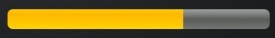
ok,搞定:
注意看,四角还是有圆倒角的,貌似是系统自己加上去的,总之我的图片里面是没有做这个倒角处理的。
二)纵向进度条
还是得从源码入手,看回progress_horizontal.xml
<item android:id="@android:id/progress">
    <clip>
        <shape>
            <corners android:radius="5dip" />
            <gradient
                android:startColor="#ffffd300"
                android:centerColor="#ffffb600"
                android:centerY="0.75"
                android:endColor="#ffffcb00"
                android:angle="270" />
        </shape>
    </clip>
</item>
为什么shape外面要包一层clip呢,官方文档解释是clipdrawable是可以自我复制的,来看看定义:
<?xml version="1.0" encoding="utf-8"?>
<clip
    xmlns:android="http://schemas.android.com/apk/res/android"
    android:drawable="@drawable/drawable_resource"
    android:clipOrientation=["horizontal" | "vertical"]
    android:gravity=["top" | "bottom" | "left" | "right" | "center_vertical" |
                     "fill_vertical" | "center_horizontal" | "fill_horizontal" |
                     "center" | "fill" | "clip_vertical" | "clip_horizontal"] />
android:clipOrientation有两个属性,默认为horizontal
android:gravity有多个属性,默认为left
那我们试试改成vertical和bottom会有什么效果,新建一个progress_vertical.xml,把源码progress_horizontal.xml的内容复制过来,这里去掉了secondaryProgress,修改了clip,shape的渐变中心centerY改为centerX:
<item android:id="@android:id/progress">
    <clip
        android:clipOrientation="vertical"
        android:gravity="bottom" >
        <shape>
            <corners android:radius="5dip" />
            <gradient
                android:startColor="#ffffd300"
                android:centerColor="#ffffb600"
                android:centerX="0.75"
                android:endColor="#ffffcb00"
                android:angle="90" />
        </shape>
    </clip>
</item>
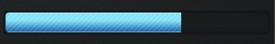
布局中android:progressDrawable="@drawable/progress_vertical"
ok,搞定,就是这么简单:

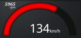
三)弧形bar
这个也许算不上是进度条,用的也不多,最多也就仪表盘用用,不然谁会把进度条整成圆弧的呢。好吧这个可不是改改源码就能搞定的,看代码:
public class Arcs extends View {
    private Paint mArcPaint;
    private Paint mArcBGPaint;

    private RectF mOval;
    private float mSweep = 0;
    private int mSpeedMax = 200;
    private int mThreshold = 100;
    private int mIncSpeedValue = 0;
    private int mCurrentSpeedValue = 0;
    private float mCenterX;
    private float mCenterY;
    private float mSpeedArcWidth;

    private final float SPEED_VALUE_INC = 2;

    ..........

}
首先是一堆成员变量,两个Paint用来画圆弧一个前景一个背景,一个RectF圆弧就画在上面,然后是一些控制参数比如sweep圆弧扫过的角度,xy坐标等等。
然后设置两个画笔,颜色,宽度,样式等等,BlurMaskFilter笔是边缘模糊效果,有几种,可以自己尝试:
mArcPaint = new Paint(Paint.ANTI_ALIAS_FLAG);
mArcPaint.setStyle(Paint.Style.STROKE);
mArcPaint.setStrokeWidth(mSpeedArcWidth);
// mPaint.setStrokeCap(Paint.Cap.ROUND);
mArcPaint.setColor(0xff81ccd6);
BlurMaskFilter mBlur = new BlurMaskFilter(8, BlurMaskFilter.Blur.INNER);
mArcPaint.setMaskFilter(mBlur);

mArcBGPaint = new Paint(Paint.ANTI_ALIAS_FLAG);
mArcBGPaint.setStyle(Paint.Style.STROKE);
mArcBGPaint.setStrokeWidth(mSpeedArcWidth+8);
mArcBGPaint.setColor(0xff171717);

BlurMaskFilter mBGBlur = new BlurMaskFilter(8, BlurMaskFilter.Blur.INNER);
mArcBGPaint.setMaskFilter(mBGBlur);
接着重写父类View的onSizeChanged,为的是自己根据布局中的大小做居中处理:
@Override
protected void onSizeChanged(int w, int h, int ow, int oh) {
    super.onSizeChanged(w, h, ow, oh);
    Log.i("onSizeChanged w", w+"");
    Log.i("onSizeChanged h", h+"");
    mCenterX = w * 0.5f;  // remember the center of the screen
    mCenterY = h - mSpeedArcWidth;
    mOval = new RectF(mCenterX - mCenterY, mSpeedArcWidth, mCenterX + mCenterY, mCenterY * 2);
}
重写onDraw以便重绘canvas:
@Override
protected void onDraw(Canvas canvas) {
    drawSpeed(canvas);
    calcSpeed();
}

private void drawSpeed(Canvas canvas) {
    canvas.drawArc(mOval, 179, 181, false, mArcBGPaint);

    mSweep = (float) mIncSpeedValue / mSpeedMax * 180;
    if (mIncSpeedValue > mThreshold) {
        mArcPaint.setColor(0xFFFF0000);
    }  else {
        mArcPaint.setColor(0xFF00B0F0);
    }

    canvas.drawArc(mOval, 180, mSweep, false, mArcPaint);
}

private void calcSpeed() {
    if (mIncSpeedValue < mCurrentSpeedValue) {
        mIncSpeedValue += SPEED_VALUE_INC;
        if (mIncSpeedValue > mCurrentSpeedValue) {
            mIncSpeedValue = mCurrentSpeedValue;
        }
        invalidate();
    }  else if (mIncSpeedValue > mCurrentSpeedValue) {
        mIncSpeedValue -= SPEED_VALUE_INC;
        if (mIncSpeedValue < mCurrentSpeedValue) {
            mIncSpeedValue = mCurrentSpeedValue;
        }
        invalidate();
    }
}
drawSpeed里面:
通过计算mSweep = (float) mIncSpeedValue / mSpeedMax * 180;,然后canvas.drawArc(mOval, 180, mSweep, false, mArcPaint);会根据mSweep的变化,画出相应长度的弧度来根据与阈值的对比,还可以设定不同的颜色:
if (mIncSpeedValue > mThreshold) {
    mArcPaint.setColor(0xFFFF0000);
} else {
    mArcPaint.setColor(0xFF00B0F0);
}
calcSpeed通过一个步进来控制增量或减量,以使弧度自然过渡,减少跳跃。
ok,大功告成: